MMM Cover Development
I’ve had two publishing deals now and each time I’ve been most excited about two things: holding a final copy and seeing the cover.
As someone who has gone the traditional publishing route, I don’t have the same control over my book covers the way a self-published author would. I don’t get to pick the designer or the general art direction, and depending on the publishing house, the author might have very little say in what is agreed as the final cover.
In general, the cover needs to do a few key things: primarily it needs to look intriguing so someone will pick it up, but it also needs to give a vibe of the book and it needs to look like it identifies with its genre.
With Renegade, my editor put together a document called a ‘cover brief’. This gave a brief overview of the book and mentioned its key aspects. In this case, we have a gothic/dark academia/horromance set in the art world. She then looked at similar books and made notes about each of their covers, talking about what we liked and what we could introduce for Man, Muse, Monster. The idea was to fit with the dark academia genre while highlighting that we are doing something new because MMM is about art. I was also able to send an aesthetic I’d put together via Pinterest, and included a couple of paintings I loved that had inspired the type of art my main character paints.
This document was then discussed with the wider team and sent to a designer.
The designer came back with two initial iterations. One was heavily led by the team and one was a wild card that the designer gave as an option:
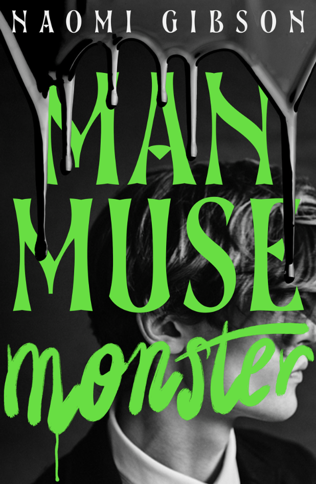
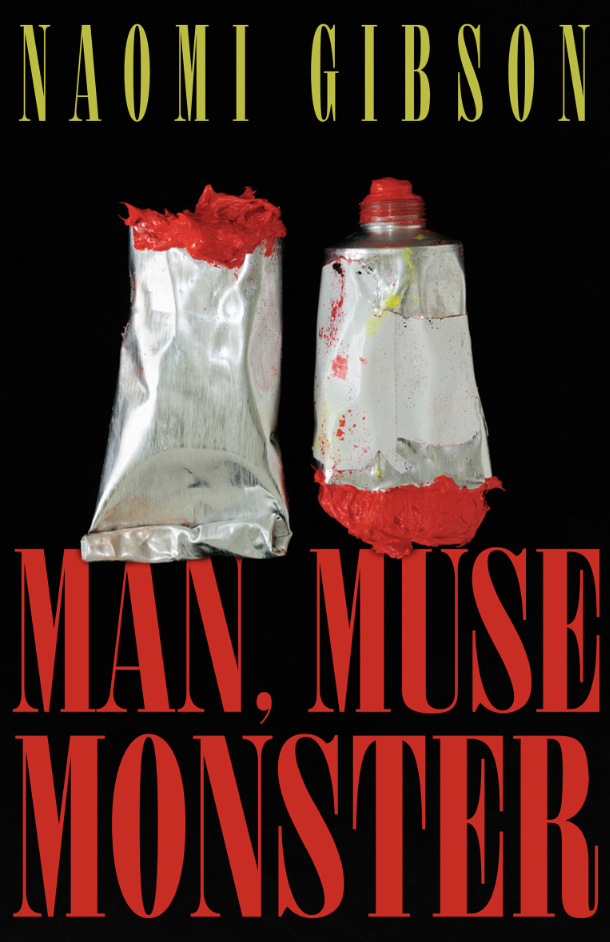
I was very excited to receive both of these in my inbox! I thought they were absolutely stunning. I could really see what the team were trying to achieve with the one on the left, and I could equally see what the designer was trying to do with the one on the right. The left was classic dark academia and the right looked like an old movie poster with horror vibes.
After a good scream at my phone at how beautiful they were, I went away and had a think. I also shared them with close friends for their opinion.
Overall, I decided that the one on the left was my favourite but it felt kind of YA. I love YA (I have 2 YA books published!) but I wanted this cover to cement that I was writing adult now. I asked if I could see this in a different colourway. For the one on the right, I felt in the end that it looked literary. I thought it would be interesting to see further developments of both covers.
I gave these thoughts to my editor, who passed on to the wider team and the designer. I was then sent these updates!
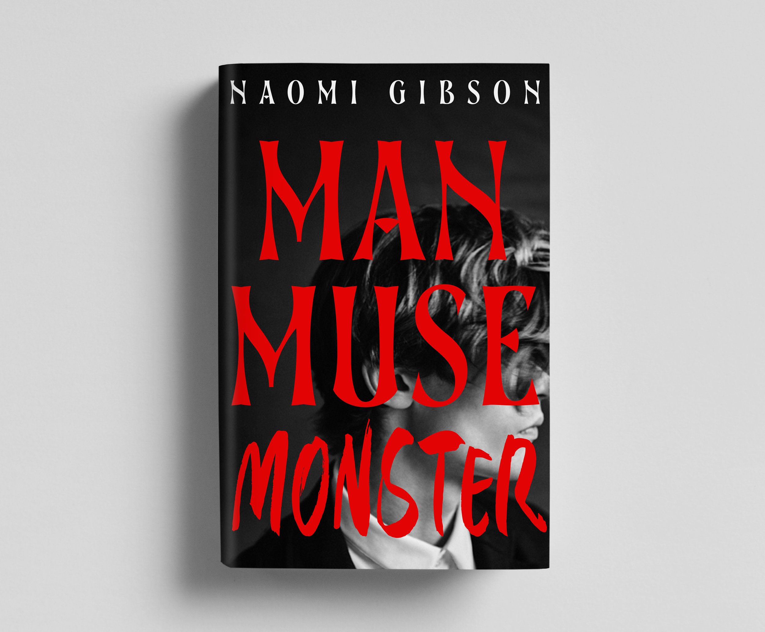
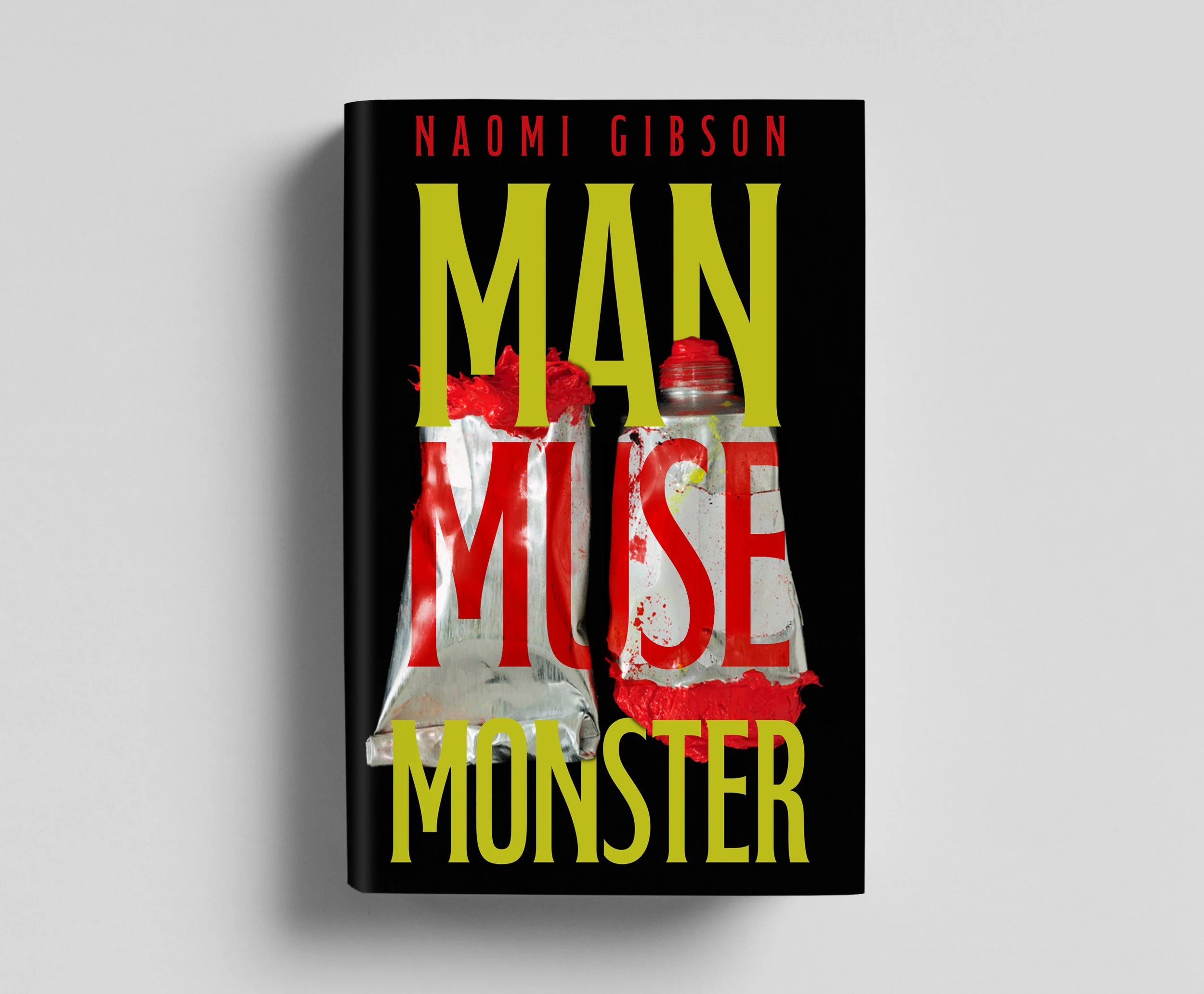
These were in direct response to my feedback, and I was really pleased to have been taken so seriously! The one on the right had more identity, but the one on the left still felt like it was missing something. Luckily the team had also fed back to the designer and I was sent the below:
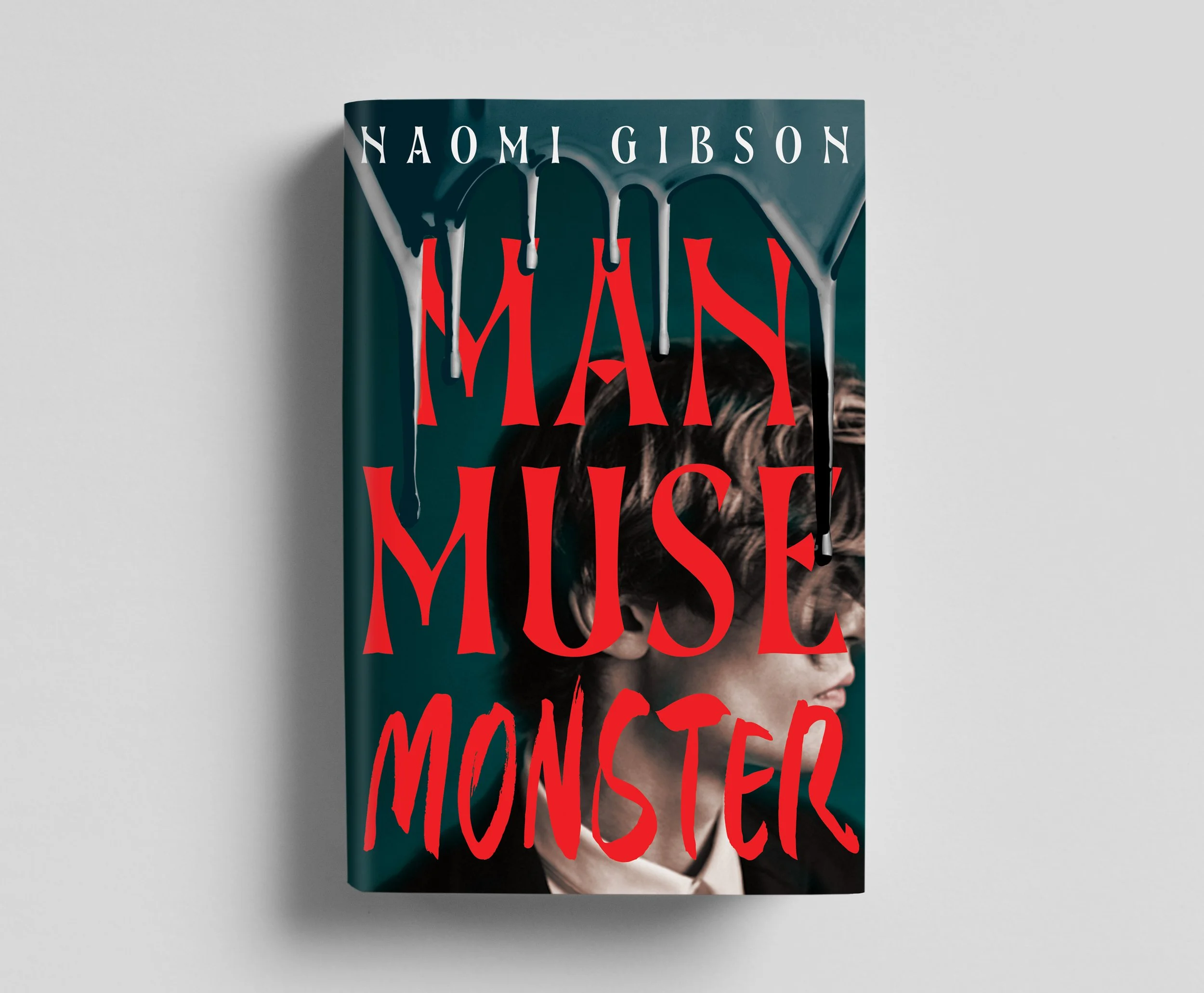
I was SO excited to receive this in my inbox. The designer had absolutely nailed it. The move away from the black/white/green colourway was a solid choice . The red and dark blue with the muted portrait in the background are absolutely perfect. I love the font for the title, the font for my name, and the paint drips tie off the cover so beautifully. It fits the book so well, I was very pleased.
I am one lucky author.
So there you have it! The evolution of a cover brief and an aesthetic, to the final cover. Book designers are so talented and you should absolutely check out Sofia Hericson, who designed this dark academia beauty.